Designing brands that tell stories and move people
I build brands, design content systems, and create digital experiences. Specialized in graphic design, brand building, social media strategy and using AI as a creative tool — not a shortcut.
Scroll to explore
Selected Work
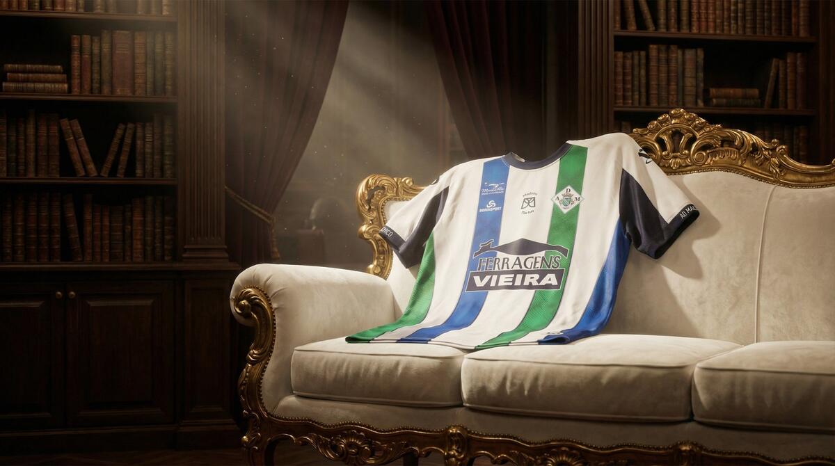
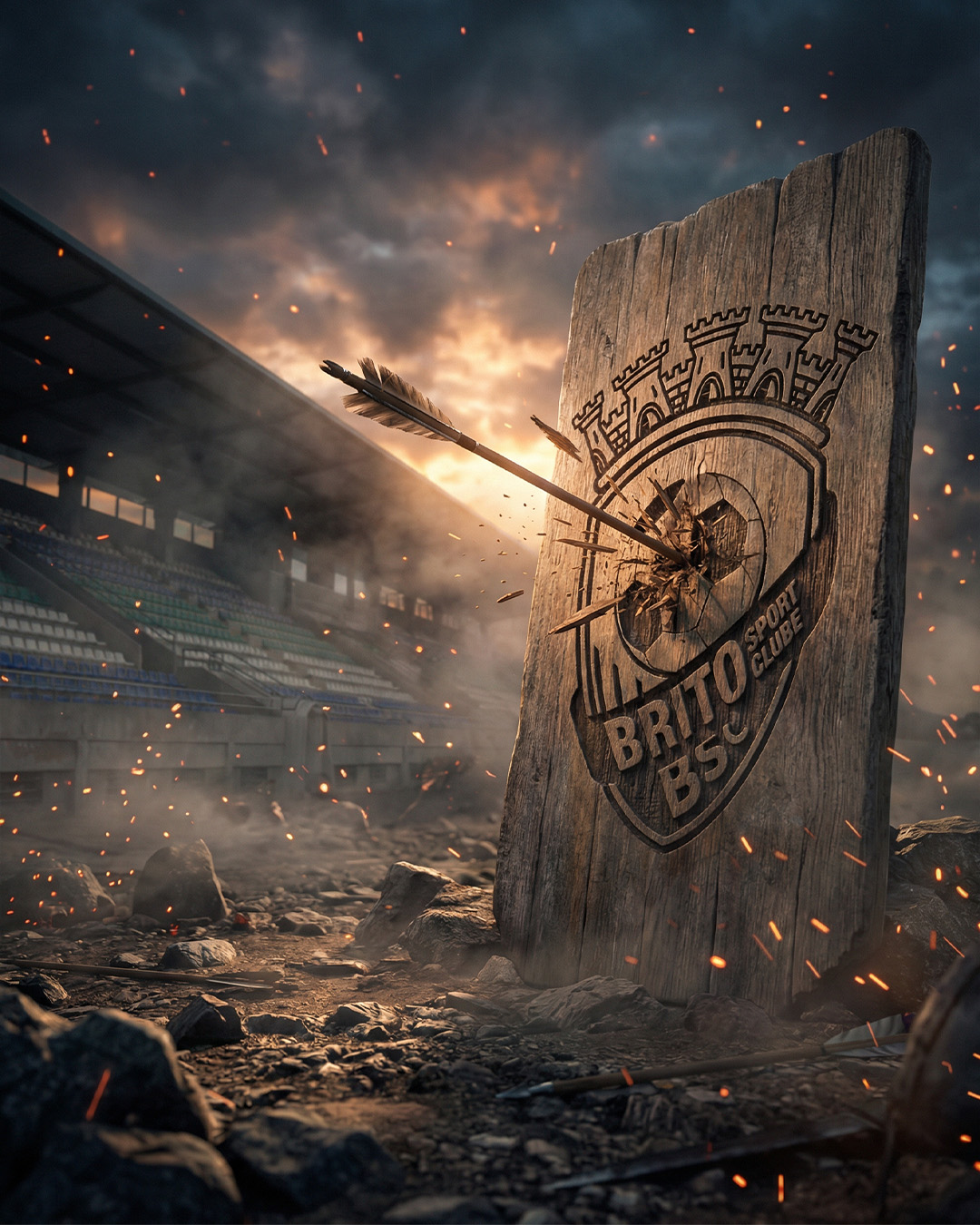
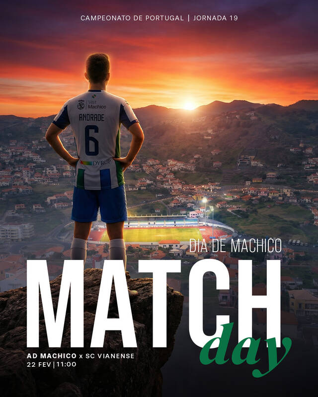
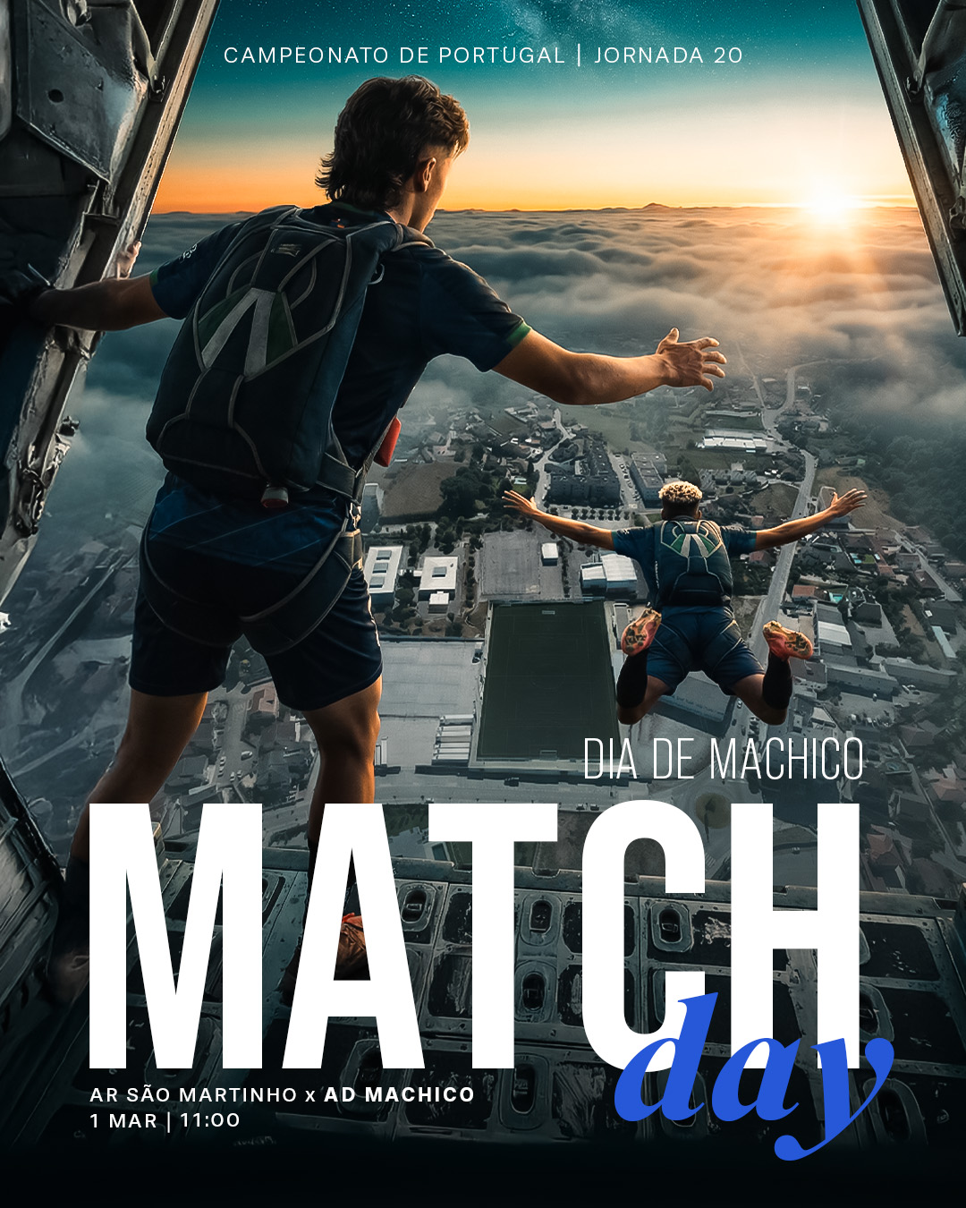
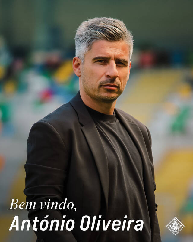
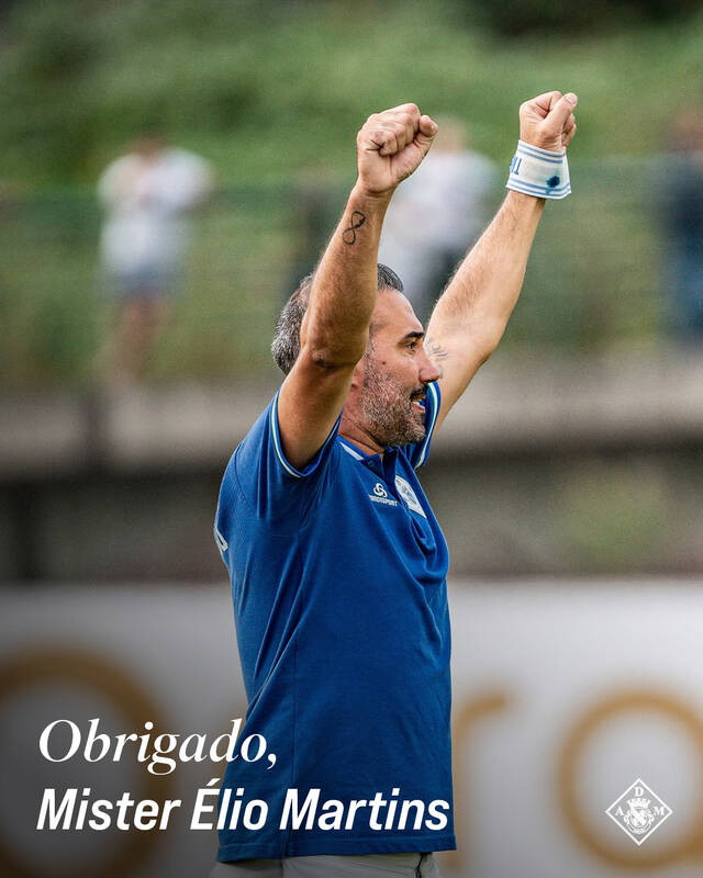
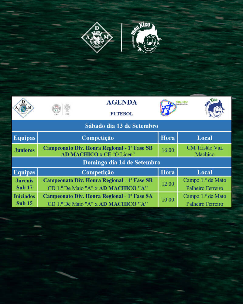
AD Machico
Complete visual rebranding and social media management for a football club in the Campeonato de Portugal. From outdated posts with 50 likes to a cinematic content machine pulling 800K monthly views — built solo, with zero creative budget.
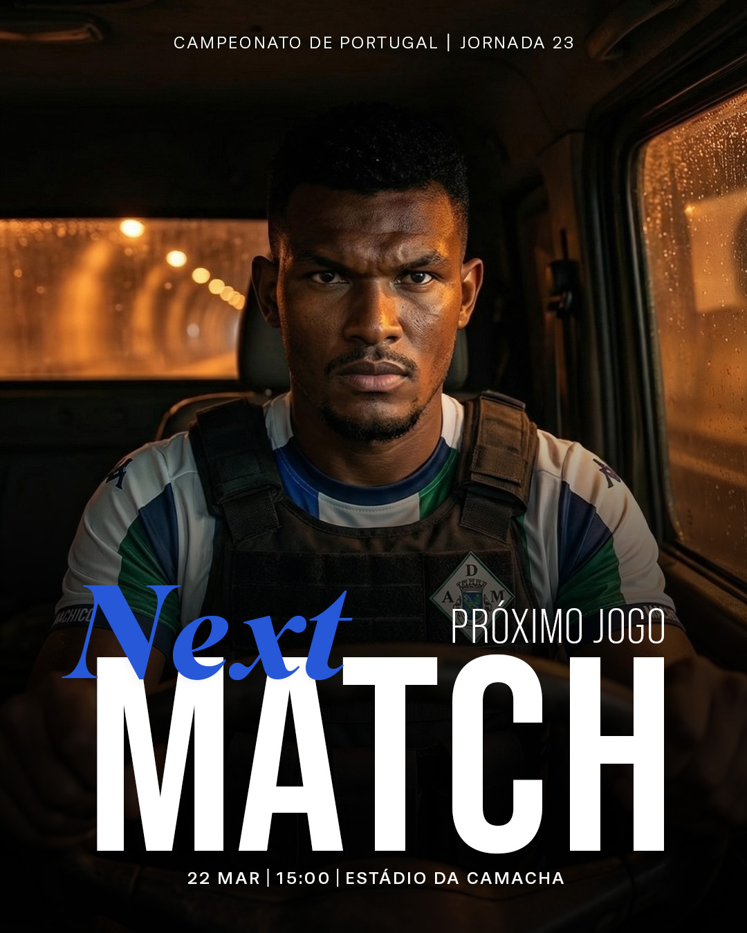
Design system: The color palette adapts dynamically depending on whether the team plays home or away. Every graphic shifts from green tones for home fixtures to blue tones for away matches, creating immediate visual recognition while maintaining brand consistency.
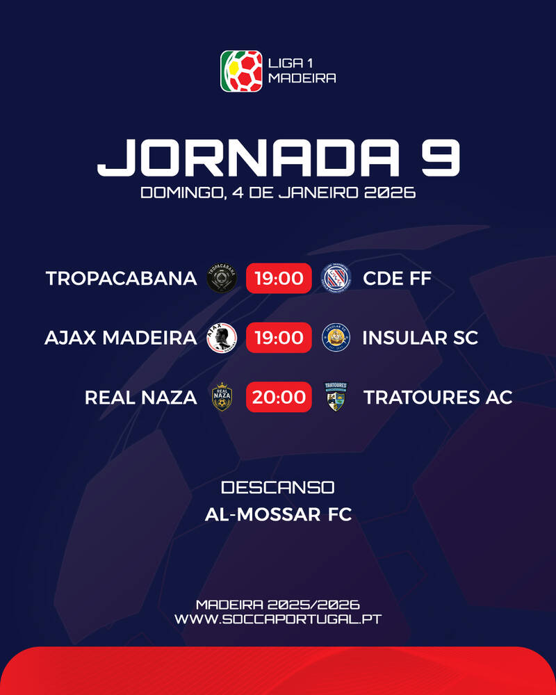
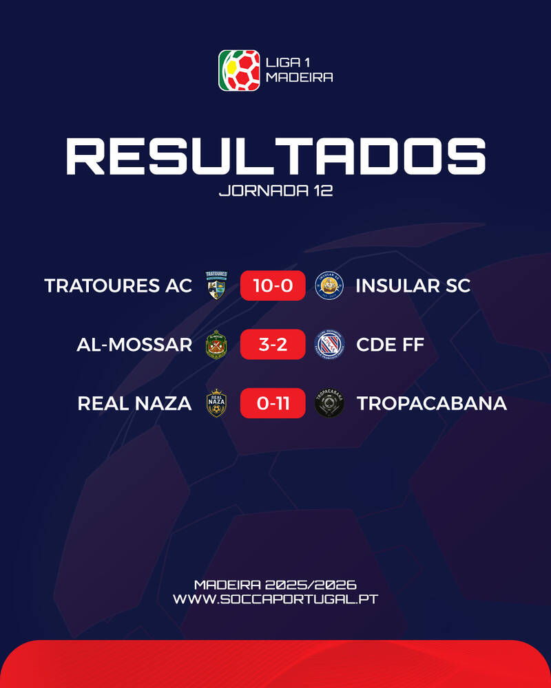
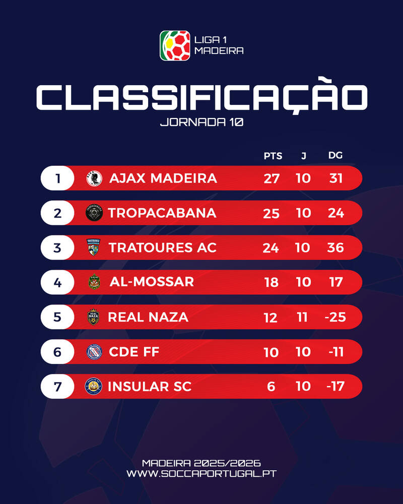
Visual identity and social media design for SOCCA Portugal's inaugural Madeira league season. Working within strict national brand guidelines while finding moments to elevate the content beyond the template.
Brand GuidelinesSocial Media DesignSports DesignAI-Assisted Design
An art print brand I built from zero — from identifying a gap in Madeira's souvenir market, to designing 15 illustrated prints, to building a brand identity and getting the product into retail stores.
I'm a graphic designer based in Madeira Island, Portugal. I specialize in brand identity, sports design, and creative content strategy — with a focus on using generative AI as a creative tool to solve real problems, not replace real thinking.
My work spans from rebranding football clubs to launching my own product line. What ties it all together is the same approach: understand the audience, find the story, execute with intention.
I've spent the last few years investing heavily in AI-powered creative tools — not as a trend, but because I've seen firsthand how they can solve real constraints like zero-budget photography. The tools change; the creative direction doesn't.
Experience
Junior Digital Designer at Tekuchi Creative Director at AD Machico Designer at SOCCA Portugal Founder of The Madeira Gallery
Education
Graphic Design & Artificial Intelligence Lisbon School of Design
Complete visual rebranding and social media management for a football club in the Campeonato de Portugal. Hired to modernize the club's digital identity, I became the sole creative responsible for all design output across senior and youth football.
When I joined AD Machico, the club's digital presence was outdated, visually inconsistent, and failing to engage fans. Posts were functional but uninspiring — basic information with no storytelling, no emotion, no reason for fans to care.
The biggest constraint: zero budget for professional photography. Without high-quality assets, creating the cinematic, emotional content that modern sports fans expect seemed impossible.
The Approach
Rebranding the Visual Identity
The first step was rethinking the club's entire visual language. I established a new creative direction — cleaner, bolder, cinematic — that positioned AD Machico's brand at a level far above what's typical for clubs at this division.
Creative Direction & Storytelling
The core of the rebranding wasn't a tool or a technique — it was a shift in philosophy. I moved the club's content from purely informational to narrative-driven. Each post became a piece of storytelling: building anticipation, creating emotion, giving fans a reason to engage.
It's not about giving information — it's about giving emotion.
Solving the Asset Problem
Rather than accepting lower-quality content, I integrated generative AI as one of several tools in my workflow. Combined with Photoshop compositing, real match photography, and strong art direction, this allowed me to produce cinematic-quality visuals within zero budget.
The AI didn't do the creative work — it gave me more raw material to execute my vision. The concepts, compositions, brand consistency, and storytelling were all mine.
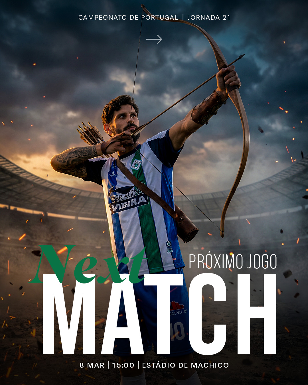
Next Match — Home (Green)Next Match — Away (Blue)
Design system: The color palette adapts dynamically — green tones for home fixtures, blue tones for away matches — across every graphic type, creating immediate visual recognition while maintaining brand consistency.
Home
Away
Content Types
Every content type serves a purpose within the broader narrative. The system covers the full matchday cycle — from anticipation through to results — plus institutional announcements and youth football.
Matchday — HomeMatchday — Away
Matchday Cinematic Video — AwayMatchday Cinematic Video — Home
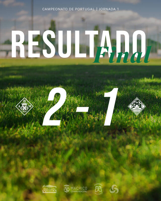
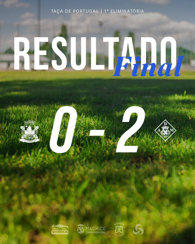
Final Score — League (Home)Final Score — Cup (Away)
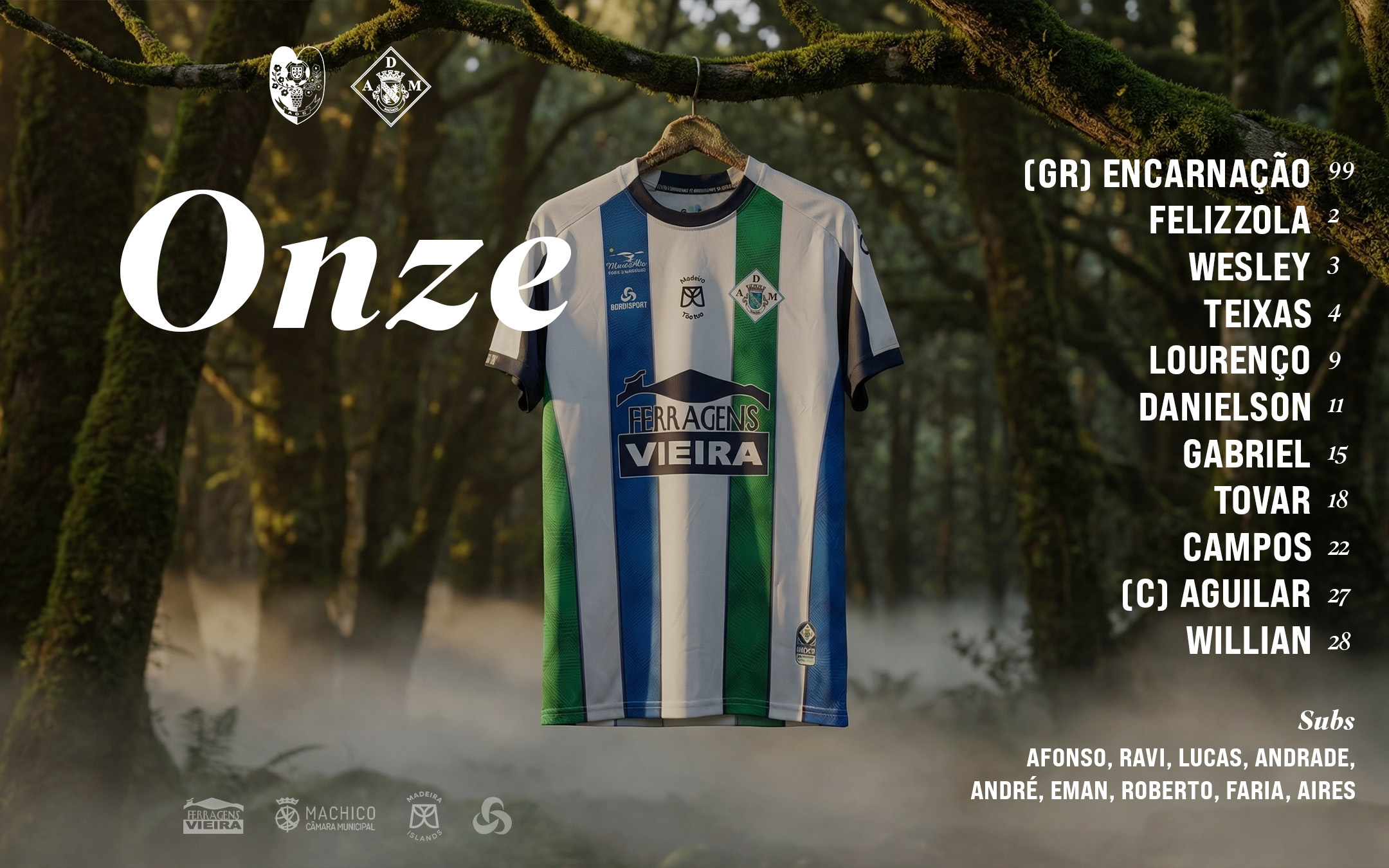
Starting XI — Lineup announcement
Institutional Announcements
Beyond matchday content, the visual identity extends to all club communications. Coaching changes, player transfers, and institutional moments receive the same premium treatment.
Welcome — New coachFarewell — Departing coach
Events & Milestones
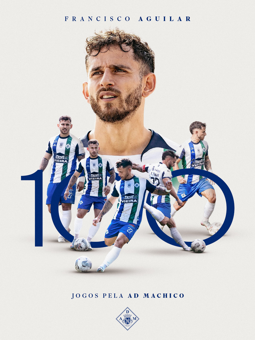
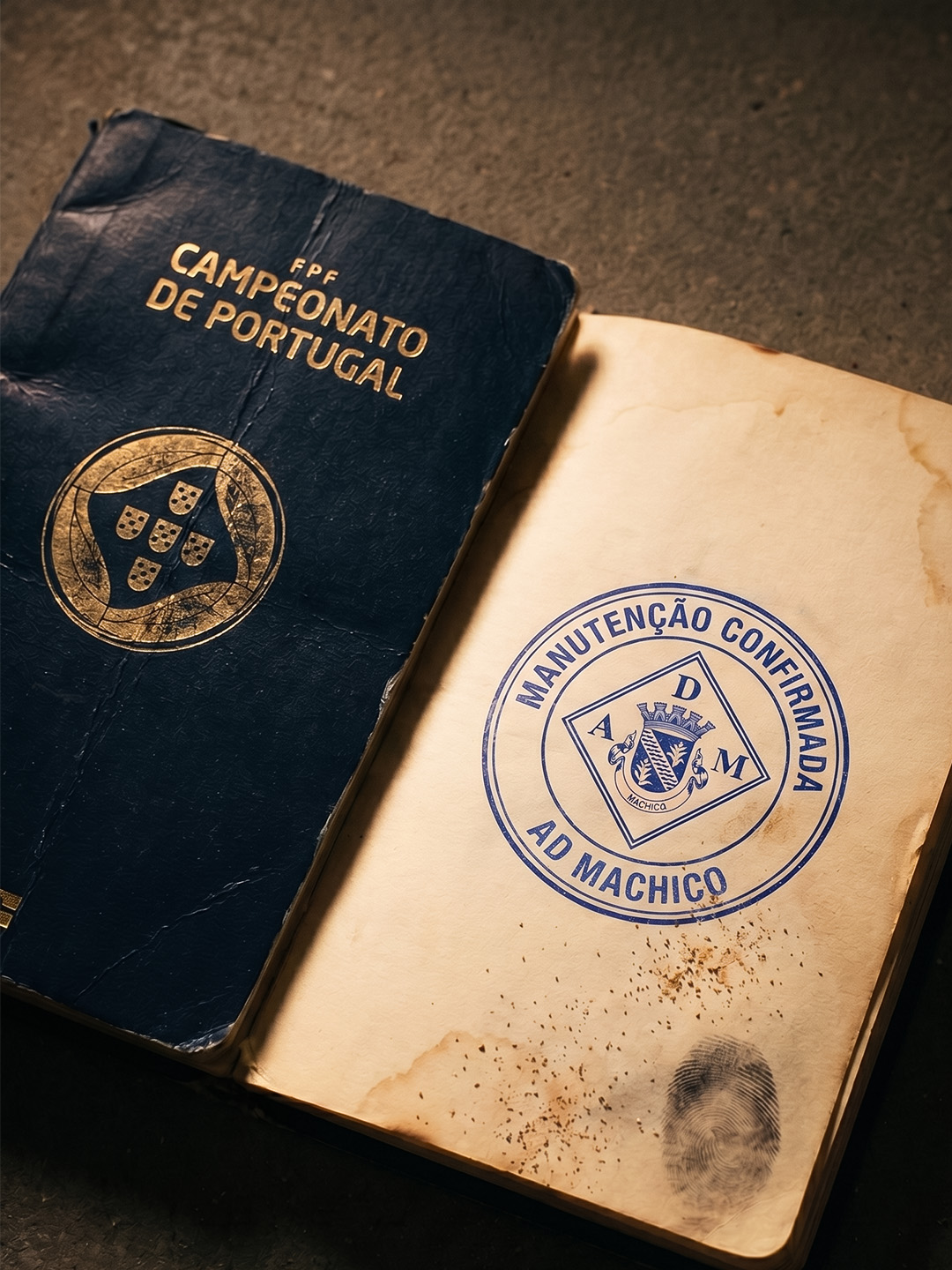
The visual system extends to key moments that go beyond matchdays. Player milestones, league confirmations, and landmark celebrations are given the same storytelling treatment — elevating each moment with distinctive, cinematic graphics.
100 Games — Francisco AguilarLeague Maintenance — Campeonato de Portugal
Youth Football & Scheduling
The brand system extends across all youth teams. Weekly training calendars and fixture lists received the same visual treatment — clean, on-brand, consistent — ensuring every age group's families felt connected to the club's identity.
Weekly calendar coverTraining schedule — All age groups
Results
Posts went from ~4K views and ~50 likes to consistently 10K+ views and 200+ likes — a 6x increase in engagement.
800K+ views in a single month. 22,497 accounts reached per month, with 36.3% from non-followers — organic audience discovery.
Top posts consistently hitting 16K–32K views, with the championship celebration reaching 32,695 views. For a 4th-tier club, these are numbers that many clubs in higher divisions don't achieve.
Tools & Workflow
Design
Adobe Photoshop
AI Image Generation
NanoBananaPro
AI Video
Kling AI, Higgsfield
Turnaround
30 min – 2 hours per graphic
Team
Solo — all creative, design, strategy
Duration
9 months (ongoing)
Key Takeaway
This project shows what happens when strong creative direction meets real business constraints. With no budget, no team, and no professional assets, I built a visual identity that turned a small local club into one of the most visually compelling brands at its level in Portuguese football.
The results weren't driven by any single tool. They were driven by understanding an audience, telling stories that matter, and executing consistently for 9 months.
Case Study — 2025/2026
SOCCA Portugal Madeira
Visual identity and social media design for SOCCA Portugal's inaugural Madeira league season. Working within strict national brand guidelines while finding moments to elevate the content beyond the template.
Brand GuidelinesSocial Media DesignSports DesignAI-Assisted Design
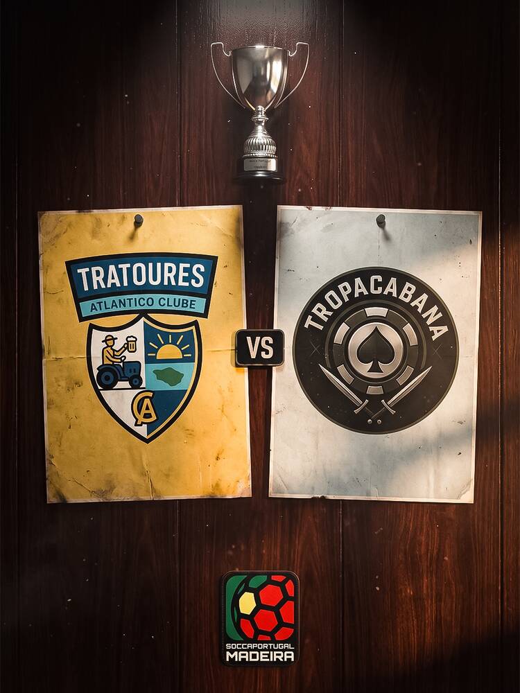
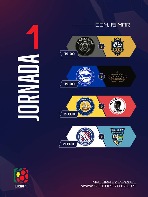
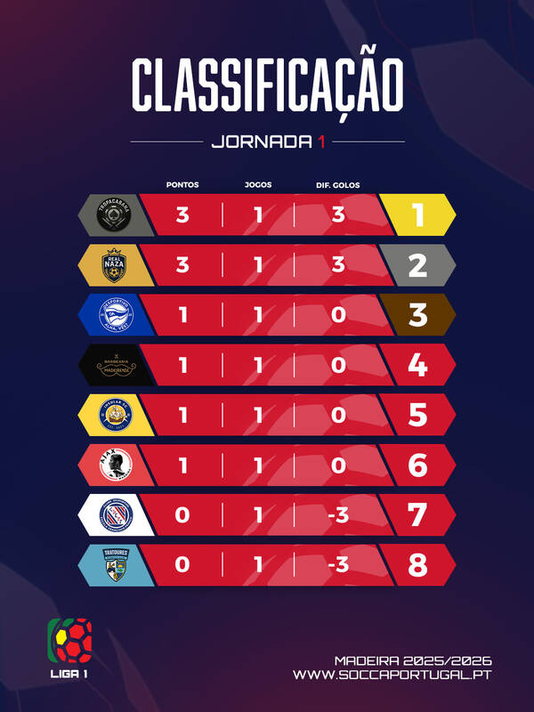
Liga 1 Madeira — Standard Templates
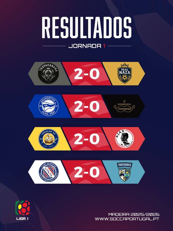
The top division's content follows the red-branded template system. Jornada fixtures, Resultados, and Classificação are published weekly, maintaining the rhythm fans expect.
For the new season, I redesigned the full template system with a more modern, eye-catching approach. The new designs use hexagonal shapes inspired by the football — the core symbol of SOCCA Madeira — creating a stronger visual connection to the sport. I updated the typography to something more modern and elegant while keeping references to the original SOCCA branding and design foundations.
Liga 1 — Madeira
The Liga 1 templates use bold red tones that give the top division a strong, vibrant identity. The hexagonal motifs frame each team's badge, creating a cohesive system across results, standings, and matchday graphics.
ResultadosClassificaçãoJornada
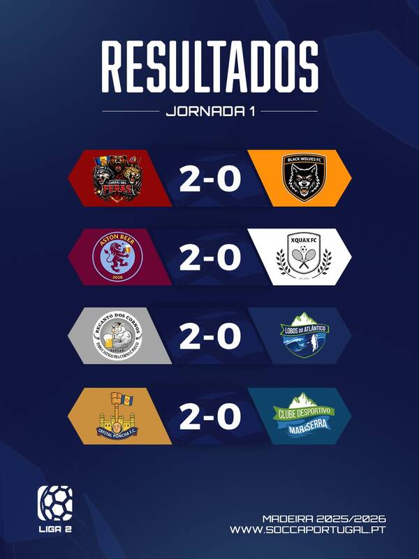
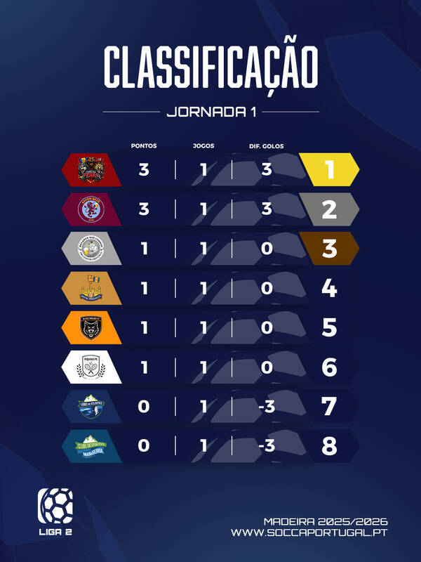
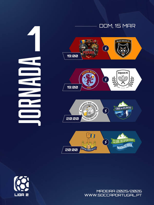
Liga 2 — Madeira
Liga 2 follows the same design system but with a deeper blue palette, giving the second division its own distinct character while maintaining visual consistency with Liga 1. The same hexagonal shapes and typography tie both leagues together under one unified brand.
ResultadosClassificaçãoJornada
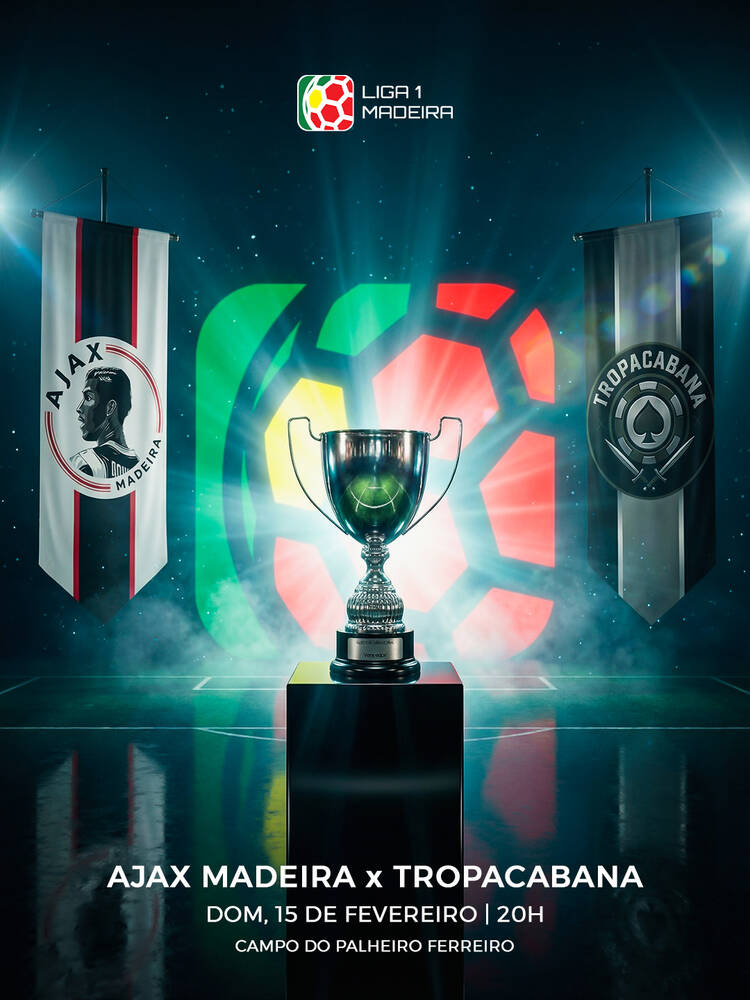
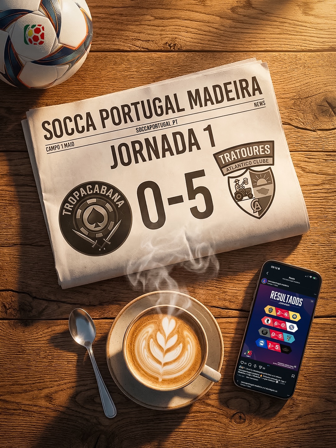
Pushing Boundaries for Key Moments
For the moments that mattered most — finals, cup matches, big rivalries — I deliberately pushed beyond the standard templates. Using cinematic AI-generated compositions and bolder visual treatments, I created content that gave these fixtures the weight they deserved.
The cup final graphic with the trophy, banners, and dramatic lighting. The vintage poster aesthetic for a semi-final. These weren't random creative choices — they were strategic decisions to elevate the most important moments while respecting the brand's foundations.
Cup Final — CinematicCup Semi — Vintage poster
KitKat — Viral result postJornada 1 — Newspaper concept
What I Learned
This project is the counterbalance to AD Machico in my portfolio. Where Machico shows what I can do with total creative freedom, SOCCA shows I can deliver quality work within someone else's framework. Both skills matter — and the discipline of working within constraints made me a better designer.
What's Next
For the 2025/2026 season, I redesigned the complete template system — giving Liga 1 and Liga 2 distinct visual identities while keeping brand consistency. The evolution from Season 1 to Season 2 demonstrates how I iterate and improve design systems over time.
Tools & Role
Design
Adobe Photoshop
AI Image Generation
Used for special match graphics
Role
Designer → Designer + Social Media Manager
Duration
Since October 2025 (ongoing)
Case Study — 2026
The Madeira Gallery
An art print brand built from zero — from identifying a gap in Madeira's souvenir market, to designing illustrated prints of the island's most iconic locations, to building a brand identity and getting the product into retail stores.
Madeira Island attracts over 3 million tourists per year, but the souvenir market is dominated by generic fridge magnets, mass-produced postcards, and low-quality keepsakes. There was a clear gap: no premium, locally-designed art prints that tourists could take home as a meaningful memento of the island.
I saw an opportunity to create something better — illustrated prints that capture Madeira's most iconic locations with a distinctive artistic style, printed locally, and positioned as affordable art rather than cheap souvenirs.
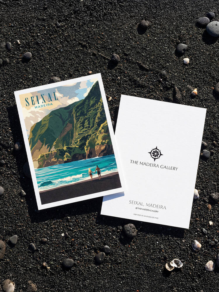
The Product
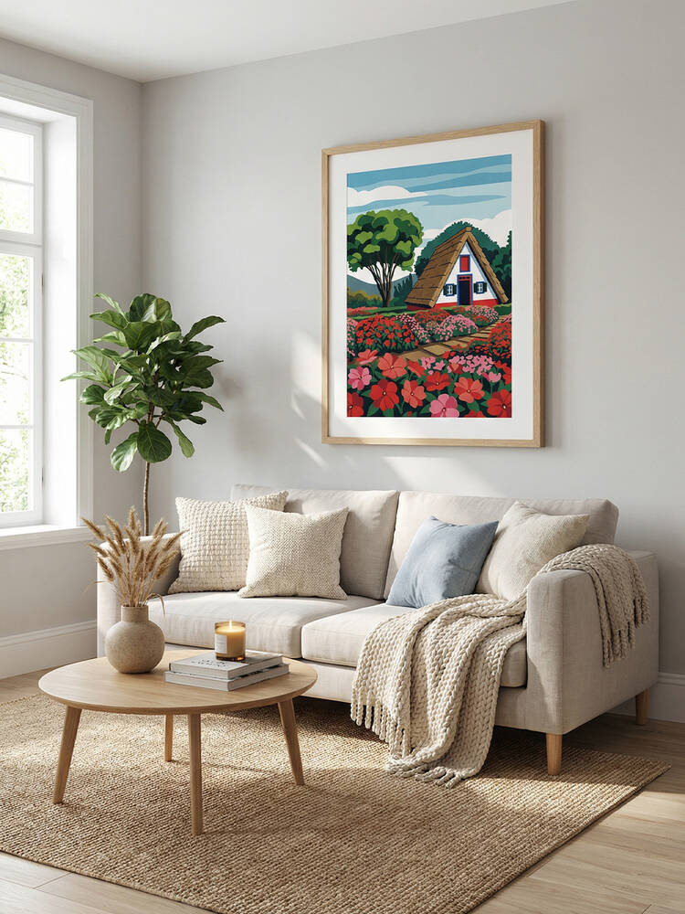
Each print illustrates a different Madeira landmark in a bold, contemporary travel poster style. The collection covers the island's most visited and photographed locations — from the volcanic pools of Porto Moniz to the black sand beach of Seixal to the traditional A-frame houses of Santana.
Every print is designed to work both as a standalone piece and as part of a collection. The illustration style is consistent across the range, creating a cohesive visual language that's immediately recognizable as The Madeira Gallery.
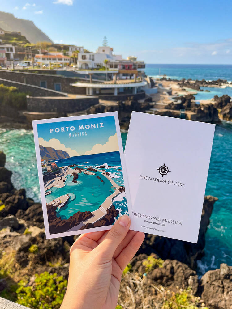
Porto Moniz — Print at the real locationSeixal — Print on black sand beach
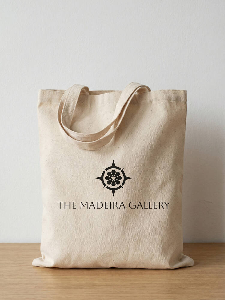
The Brand
The Madeira Gallery brand was built to feel premium but approachable. The compass-rose logo references navigation and discovery — fitting for a product that celebrates travel and exploration. The brand identity extends across print backs, tote bags, and packaging, creating a consistent touchpoint at every stage of the customer experience.
The logo itself has an origin story: it started as a design for a Visit Machico competition entry. It didn't win, but I saw its potential elsewhere — and it found its true home as the identity for The Madeira Gallery. That kind of resourcefulness is part of how I work.
Branded tote bagFramed print — Interior context
Business Model
The prints are sold through local retail stores in tourist areas across Madeira, using a consignment-based distribution model — zero risk for retailers, which makes getting shelf space significantly easier.
The pricing strategy balances accessibility for tourists with healthy margins, and the first batch of 11 designs is already in production with retail placement planned for March 2026.
What Makes This Different
This isn't a design project that stopped at the mockup stage. I handled everything end-to-end: market research, illustration, brand identity, print production, pricing strategy, retail negotiations, and distribution logistics. It's the full journey from identifying an opportunity to getting a physical product into stores.
Tools & Process
Illustration
Hand-designed concepts, AI-assisted illustration + refined in Adobe Illustrator